
Let's Play A Game
I recently posted a roast curve on my IG to illustrate how the way one sets the axes (the ranges for time, temperature, and ROR) affects a curve’s appearance.
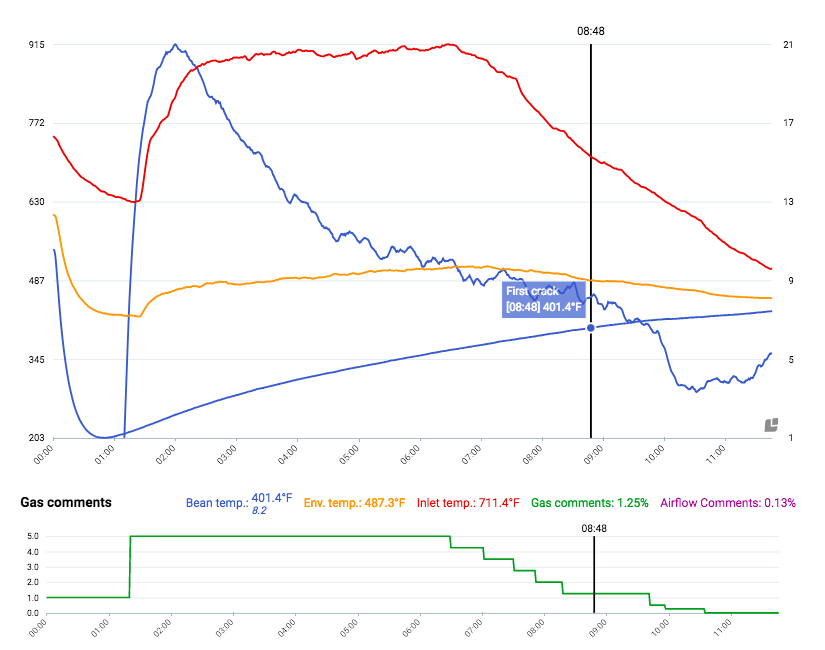
For instance, if one sets the ranges too high, a curve may look like this:

Note how the ROR curve is compressed into a tiny vertical space. Curve views like this one are quite common (and useless).
Minimizing the ranges of the axes expands the curves and provides a better view:
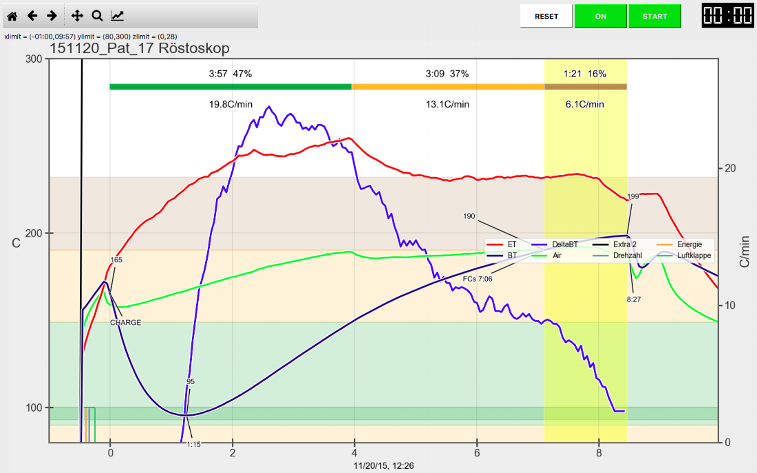
Red = Inlet Temp… Blue = Bean Temp ROR…Green = Environmental Temp
While this may seem obvious to many readers, I see a tremendous number of roasters, both in person and on Instagram, setting their graph axes more like the former than the latter. Such curve views will make a roaster overly confident in his or her results. Quality Control and progress will suffer.
A while back, I badgered the fine folks at Cropster to automatically adjust the axis ranges. While Cropster can’t do that during a roast, as it has no way of knowing what the necessary ranges will be, they listened and made the range-minimization automatic when viewing past roasts.
The same principle of optimizing the curve view applies to adjusting ROR smoothing (via the ROR interval in Cropster or the delta span in Artisan) and using appropriately responsive and well-located probes. These are fundamental — not advanced — concepts. Simply put, if you don’t practice all of them, you’re handicapping your roast-curve analysis for no good reason.
Going back to the Instagram post, many commenters volunteered opinions about how the coffee and the curve. I was surprised by many of the assumptions people made about what the operator had done or how aspects of the curve would affect the coffee’s flavor. (Hint: the timing of the turn is meaningless and if someone else’s turn is higher or lower than yours, it says nothing about flavor.)
Typing with one’s thumbs on Instagram is not an efficient way to have long conversations, so I thought I’d turn the discussion into a blog post. Some readers may not want to risk making mistakes publicly, but the only way to learn is to put yourself out there and have this discussion. If this conversation is productive and involves a diversity of commenters, perhaps this “game” will become a series. If that appeals to you, please participate.
So, what can (and can’t!) you glean from the curve below? Please, no questions about the coffee, machine, or curve; only answers. I’m intentionally not providing any more information than what you see below. There are no “tricks” involved — the machine, probe, coffee, batch size, between-batch protocol, etc, all fall within the realm of reasonable “best practices.” Thank you.
Red = Inlet Temp… Yellow = Environmental Temp… Blue = Bean Temp ROR